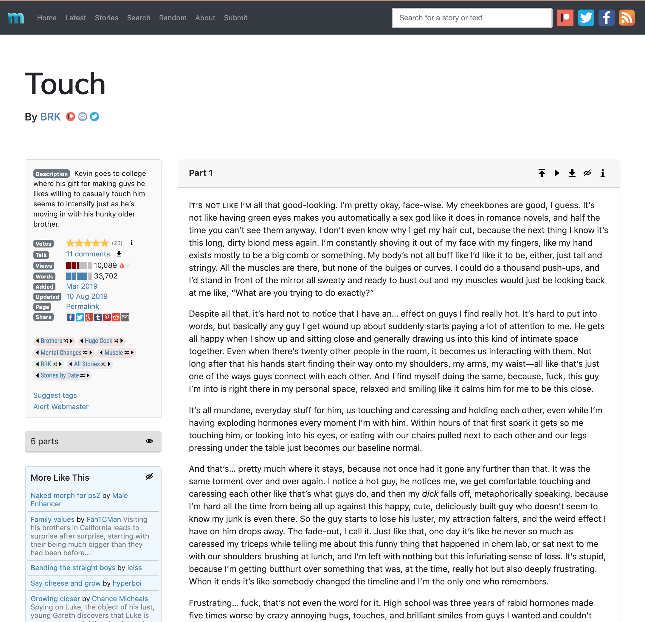
History of Metabods
Metabods was originally created in 1997, and the site has changed its look a lot over the years.
- 1997: Origins
- 2001-2003: Greekish Text
- 2004: Motorcycle and Road Sign
- 2005: Dancing Boys
- 2006: Alpha Tim
- Late 2006: The Big Mu
- 2007-2008: Alpha Tim Is Asleep
- 2009: The Pectoral M
- 2010-2016: The Pectoral M in Wikiworld
- 2016: Migration to Bootstrap
- 2017: Twentieth Anniversary
- 2019: New Site Design
- 2021: Weekly Updates and Various Tweaks
- 2022: Twenty-Fifth Anniversary
- 2023- : Beyond 25
To see the history of cover images used with the site updates and flashbacks, visit the cover images page.
1997: Origins
Here's the origin story for the site, as told in the FAQ:
“Somewhere around 1996 I discovered Josh Dugan's multilimb stories on the net at Nifty, the comprehensive erotic story archive. I was entranced. It was like coming out all over again: I had always thought that I must be the only one who had fantasized about guys with extra arms (among other things). And here were these stories on the net for all the world to see! If there was another guy there had to be more. I was immediately inspired to write my first two multilimb stories (“The body shop” and “Army experiment”—still two of my personal favorites, as your firstborn often are <g>), which I submitted to Nifty. The Nifty Archivist duly posted my stories, but then sent me a note that suggested that perhaps one prolific author in this vein might be enough for his site.”
“At first I was angry at being discouraged so soon after my revelation, but later I realized he was right in a way: The proportion of one writer to all the writers on Nifty is probably not dissimilar to the proportion of gay guys interested in multilimb stories in relation to the gay population. So, being a web developer, I started my own web site, sometime in 1997.”
Why "Metabods"? “My first site was on a UNIX server and I needed a site account name that was eight characters or less.”
I honestly have no idea at this point what the site looked like back in the 20th century. Wayback Machine has archived the site as far back as 2001, but before that there are no vestiges that I can find, and two hard drive failures in the early 2000s pretty thoroughly rid me of any local copies of my earliest efforts. (At one point early on I remember having had to reconstruct my story database from what was already posted online.)
I do seem to recall that the original logo was half Greek, half Roman, in lowercase—much like the Big Mu logo I briefly used at the end of 2006.
2001-2003: Greekish Text
I'm not sure exactly when this logo came into service, but it was in use for a few years up through 2003. The main inspiration was to do something that continued the original idea of honoring the "meta" in Metabods by deriving the logo partially from Greek text (but this time, because I was working in all caps rather than in lowercase as before, stupidly using a sigma in place of an E, despite knowing better). I also wanted to develop a theme in warm colors revolving around dark red and rich shades of orange (but with supporting tones in pinks and lavenders for some reason).
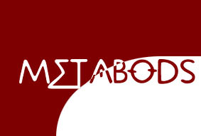
The original idea for the motif was that the brick red would wrap around the top and left sides of the page, framing the content, but that went by the wayside in favor of a more open look, as you can see from the April 2003 snapshot (via Wayback Machine). At this point the number of stories posted was 296.
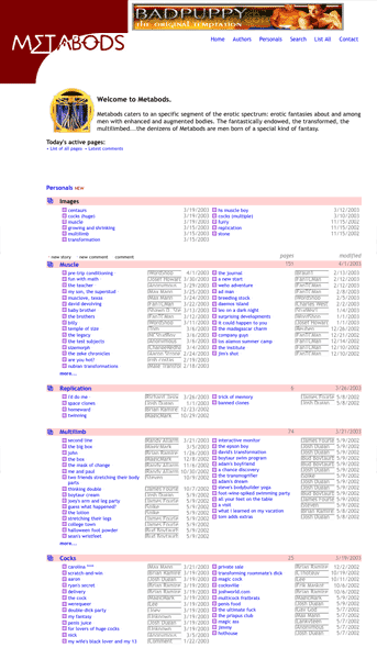
You'll notice on the story page I had a comments feature at one point. It existed on the site in 2002 and 2003, but did not last. Up until my switch to a Wiki environment in 2009, all the code and database architecture on the site was designed by me—originally using Active Server Pages and a Microsoft Access database back end. This allowed me to create my own commenting feature and, later, my own voting feature. But I had to drop both of them eventually because I couldn't keep up with abuses by malicious users and spammers. The comments were lost in the hosting switch following the Great FlashHost Disaster of Feb. 2004, and the voting was disabled a few years later. I rescued the comments into the new phpBB forum I installed in 2006, but there's a big difference between commenting on a story at the bottom of the same page, and doing so all the way over in a separate forum, so, yeah.
This incarnation lasted until the end of 2003. In December of that year I took down the site for a while. In the wake of acrimonious debate in other, muscle-growth-related forums (primarily Evolution Forum) regarding underage characters, I received notes from several contributors requesting me to review their material and remove certain kinds of content. This essentially came to mean that I had to review the entire site for certain characters and references. I took the site down until I had time to start doing this.
I overhauled the site's visual and database design in January, prepared for a fresh start. Then in February 2004—well, let's just say the first page I posted when I had to rebuild the site all over again was an angry rant page called "Please don't use FlashHost."
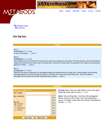
2004: Motorcycle and Road Sign
My 2004 (re)relaunch of the site involved a number of considerations. I wanted a splash screen, creating a slight sense of entry into a new space from out of the internet. But I wanted the image itself to be relatively innocuous, while still suggestive of a journey into a place that exists on its own terms. I had also recently come across a new and elegant version of the standard American highway font, which I wanted very much to use in some future graphics project.
The result was the road sign and motorcycle splash page and header that remained in use through all of 2004 and most of 2005. I loved it a lot and held onto it for a good eighteen months. (I chose this picture as a base partly because I liked it, and partly as a hint that the road ahead was, well, "twisty.")
I called this relaunch "version 8" at the time—these "versions" doubtless referring changes in the back-end architecture, the visual design, or both. The January 2004 redesign that was wiped out when FlashHost changed servers (and brought over the 6-week-old backups instead of the live site) was therefore version 7, and the red Greekish text design must have been version 6 of the site. What the first 5 versions looked like is lost to time and memory, though I suspect that the design that immediately preceded version 6 was in blues rather than reds.
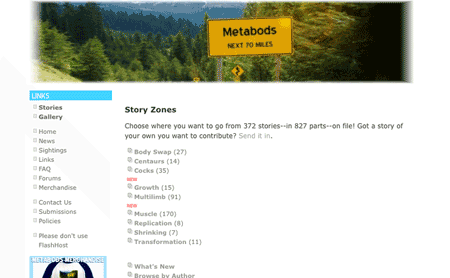
Number of stories as of mid-2004: 372. This was the version of the site with a 5-star rating system.
A couple of milestones: In May, sex pundit Dan Savage mentioned the now-defunct boytaur.net site in his syndicated column. In September I did an audio interview with Dr. J of the Changesurfer podcast, which you can listen to here.
In December I upgraded the image galleries, concentrating on work by featured artists like Merboy, Atomic Muscle, and HSMusclBoy. I didn't use any gallery software, instead doing the whole thing using my own painstakingly written code. Seemed like a great idea at the time.
2005: Dancing Boys
Partway through 2005 I succumbed to the nagging doubts I had about the motorcycle/road sign motif. I loved it, but it wasn't really directly indicative of the content of the site. I still wanted a splash screen and header that wasn't pornographic or even erotic, since random people were still going to stumble across it, but I wanted to at least convey that the site is about “guys.“
The result was the Dancing Boys motif. I'm ... not really sure why I went with this, to be honest. I suspect I was unduly influenced by the opening credits of (the American version of) Queer as Folk, which featured go-go boys in the first two seasons, and the cast members dancing and hanging out against a white background in the remaining three.
I sort of like the logo itself, at least, and the color palette is kinda nice.
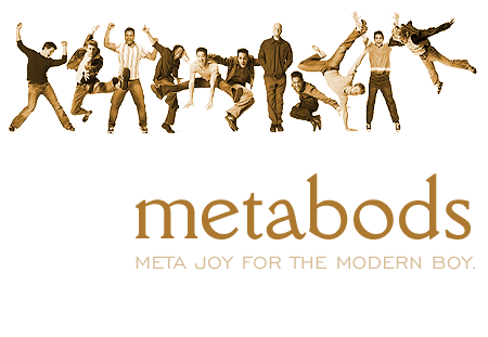
At least they're not spelling out Metabods, YMCA-style.
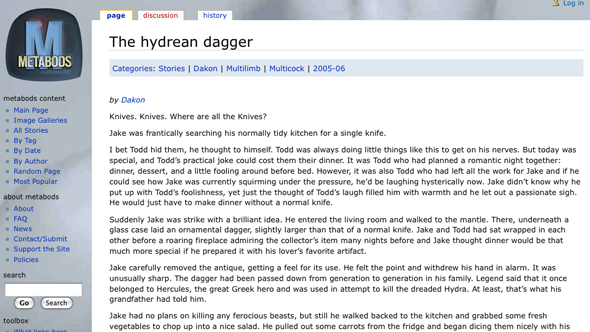
That summer I was ambitious enough to stage a story contest, complete with an actual prize (a gift certificate at Amazon, I believe). The winner was “Uncle Matt's farm” by StevePwrBear, and some of my favorite stories came out of the contest submissions, including “The Hydrean dagger”.
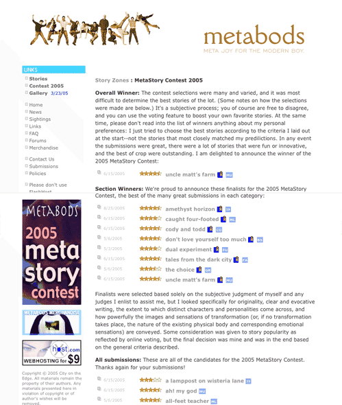
The story contest was intended to be a regular thing, and I've always meant to resurrect it—though these days the increasing diversification of the site content has meant that the site is no longer divided into the "zones" that provided easy contest categories back then. But I will definitely bring the thing back at some point.
Number of stories posted by the end of 2005: 470.
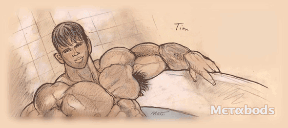
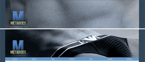
2006: Alpha Tim
It didn't take me too long to twig that the Dancing Boys were (a) silly and (b) not much more indicative of the site's content than the previous motif. For the 2006 redesign I got permission from the artist known as Matt, aka HSMusclBoy, to use his artwork on the front page. I figured I could parlay that into some Metabods merchandise featuring G-rated versions of his drawings, with proceeds to be split halfsies, but there's never really been much (read: any) demand for Metabods merch.
The new logo was again half-Greek but with a capital M this time and the Greek in sans-serif Lucida bold rather than Symbol font. This version of the logo always dropped out in white from whatever graphic was behind it.
My News page announcement at the time of the relaunch: "Welcome to the new version of Metabods! I've done some redesigning, I've fixed some code, I've finally fixed the galleries, and I've even replaced the clunky old forum with a brand new phpBB forum. Happy new year everyone!" I may have promised everyone I'd finally fixed the galleries, oh, seven or eight times over the years.
For the interior page I set up a scheme to randomize a rotating set of banners reflecting the different kinds of stories and images the site carried. The color palette was green and ochre.
Story count as of the end of 2006: 516.
Late 2006: The Big Mu
At the end of 2006 I planned a big revamp keyed to the site's upcoming tenth anniversary in 2007, so I closed the site for renovations and started in on a whole rethink of Metabods's design and structure.
I got as far as a new logo, again calling back to the half-Greek concept from the earliest site designs, and dropped it onto a splash screen with "coming soon" under it. It was supposed to revolve, but the javascript I set up to make it do that didn't pan out and I dropped the idea.
2007-2008: Alpha Tim Is Asleep
By the time the beginning of 2007 rolled around I already hated the new logo and the theme ideas I'd had to go with it. Instead I went back to the original Alpha Tim design to go with a much more low-key return than planned in 2007, with no anniversary activity at all.
In fact there was pretty much no activity of any sort for the next two years. The site lay essentially dormant in 2007 and 2008, as my attention was elsewhere and I didn't have the time or energy to undertake the major architectural overhaul that was obviously necessary, or the design revamp that should go with it. That all finally changed at the end of 2008.
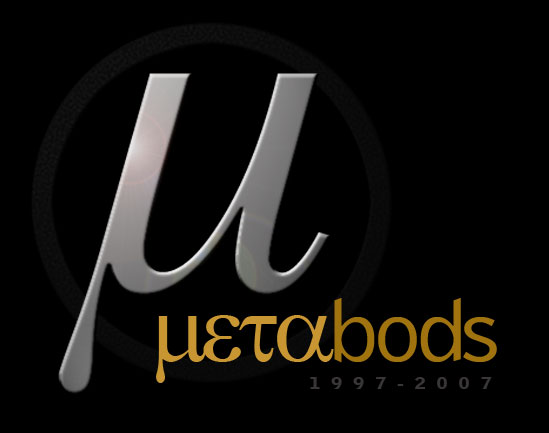
2009: The Pectoral M
At the end of 2008 I began the design revamp first, starting with the logo. I decided to move away from the half-Greek idea and develop an actual logo that could work as an avatar and as a favicon in address bars and bookmarks. So I built a new, more modular logo around a beveled capital M in slate blue, set into a rounded rectangle reminiscent of the shape of a pectoral muscle. (Yes, that's what that is.) The font is called Scout.
I retained the same logo up to the very end of 2015 (though it shifted to orange on mid-2015, as you can see below), which makes it the longest-serving Metabods logo. There was only a slight modification for the 15th anniversary year.
At first I kept the same code and the same idea of rotating banners, making up new rather more abstract ones, centered on features of the male body, in the new slate-blue color scheme. For example:
In February, forced into repairs by a server migration that had rendered my old SQL code partially unworkable, I rewrote the story retrieval apparatus and started adding contributors' stories again for the first time since 2006. By April I had the old site, with the new design, working reliably. By July I was posting my own stories again, including favorites like “The dudes”.
And then in December, just as Metabods seemed to be tentatively sailing into a renaissance, the trusty old back-end Access database finally became so superannuated that it was no longer compatible with the internet software around it. This happened at the same time as five other real-life crises, so the site shut down until I could rebuild it from scratch.
2010-2016: The Pectoral M in Wikiworld
Faced with the prospect of not just redesigning but recoding the entire site, I looked for alternatives. By this point in the history of the internet most site design problems were starting to be met with widely available open-source solutions, and for sites with a large number of articles that would all be similarly formatted, the natural solution was to build a wiki. The only thing about a wiki that was a poor fit was that wikis are designed to be editable by their readerships, but as I didn't want that I just set up my wiki with one and only one editor: me. The setup for the new site began on Christmas day, 2009.
It took me through September of 2010 to finish transferring the stories from the old database, partly because I was busy and partly because I was "reacquainting myself" with them as I went. In the meantime I was also adding new stories by contributors and writing stuff too (reaching 100 BRK stories by the end of 2012), so that the site content grew steadily.
In mid-2012 I rebooted the image section, which had been all but empty since the move to wiki (the wiki's image thumbnailing wasn't working). I started with a pile of galleries and kept adding them sporadically until the fall of 2013, when, in response to a legal scare (see the FAQ above), I took them down for good.
Apart from that both design and structure remained constant, the main addition being an effort starting in late 2013 to tie the site in more directly with social media through the addition of updates on Facebook and Twitter and via RSS, and little amenities like most-popular lists in individual categories and overall for the site. The missing element was voting, but all the Wiki extensions that are used for content voting were incompatible with my version of MediaWiki, and I couldn’t upgrade my version of MediaWiki because when I tried that last time the later version turned out to be incompatible with the hosting provider’s setup and I had to revert to the earlier version.
Reader donations ensured that 2013 was the first year I didn't have to pay hosting and bandwidth expenses out of pocket. In November 2013, I joined Twitter.
In mid 2015 I got tired of the look of the wiki site and revised the color scheme from blue to orange-red, and the fonts to an embedded Adobe Garamond.
This lasted until the end of the year, when I very briefly installed a stripped, white and green theme and a new, green version of the logo. I’m not going to show that here, because it’s even more embarrassing that the Dancing Boys design. The one good element of this particular overhaul: Starting 31 December 2015, I began a practice of regular biweekly updates. Updates had been sporadic again in 2015, and I wanted people to know they could count on receiving regular, reliable updates with new content from me and and other writers.
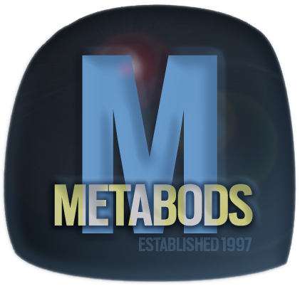
2016: Migration to Bootstrap
In response to complaints that the site was not mobile and tablet friendly, in April 2016 I began a laborious migration to an ultra-simple cross-platform environment based on Bootstrap. The migration was completed at the beginning of May, and included the return of voting alongside the Disqus commenting that had been previously introduced on the wiki site.
With the completion of the migration at the start of May 2016 and the first new stories update on 11 May also saw the passing of another milestone: the Metabods archive now had over 1,000 stories.
As the site progressed from there there were tweaks and polishes. Notably, this included routing strips for each tag, so that you can browse within tags and authors (inspired by TV Tropes, if you were wondering); an advanced search function implemented in July; and other stuff. But the overriding goal was to make sure the site is as clean and simple, and cross-platform and device friendly, I could manage so that as few visitors will experience problems as possible.

That also meant a new color scheme (back to blue, this time the base being a more muted slate blue), and a new logo, of course. I even changed the "M" branding bug and favicon for the first time (they had always been the original 2009 blue "M"):

In early 2016 I also created a Patreon account to back my writing, which developed enough of a support base that I felt able to spend more time working on stories alongside my other IRL commitments.
2017: Twentieth Anniversary
For the site's 20th anniversary, the main change was a slightly modified logo with an understated allusion to the site's longevity:
This came with tweaks to the design and a lot of minor new features.
2019: New Design
Once the twentieth anniversary was over, I decided to create a new version of the logo that incorporated the idea of transformation/growth via overlapping instances of the letter m, all masked within the m of the logomark. This new design premiered at the start of 2018.
In December 2018 I quit Tumblr, after their new policies made it clear that they did not want folks like me there.
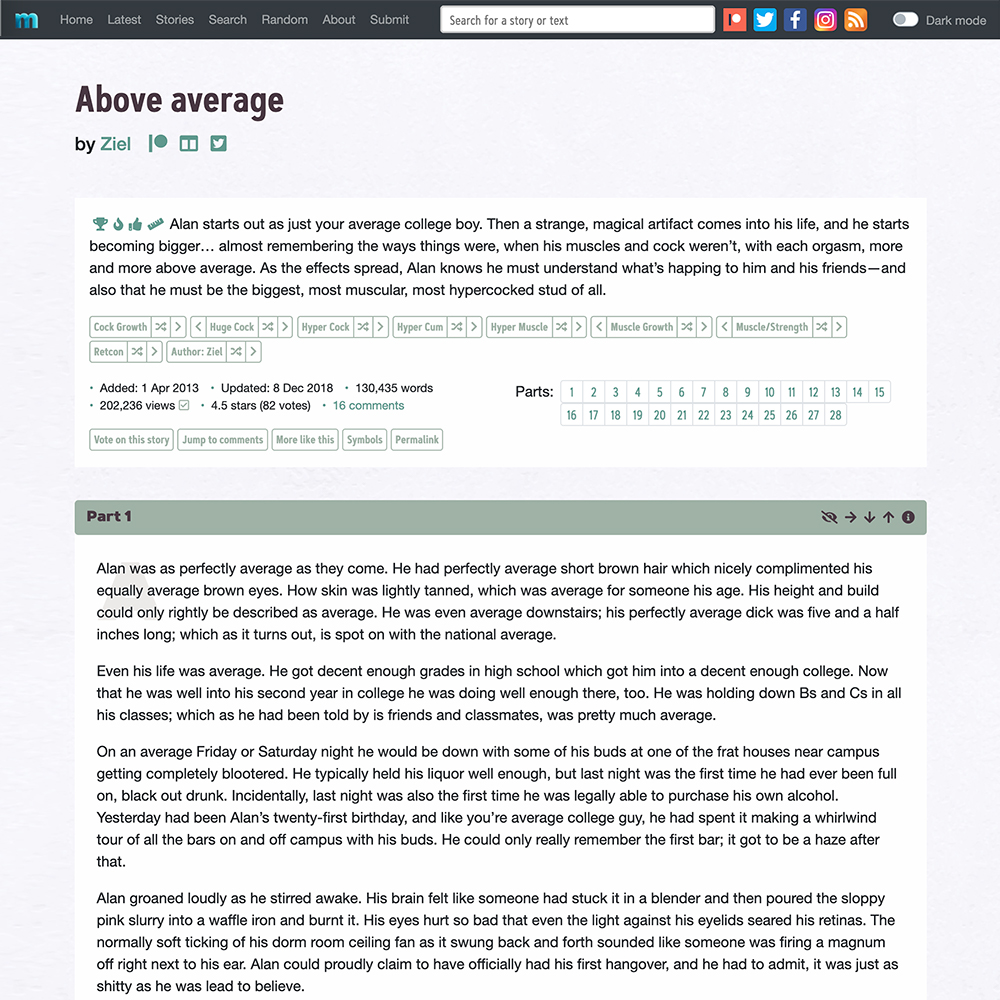
In August 2019 I began a new site design, with the goal of a cleaner, more streamlined and up-to-date look, as well as to take advantage of the latest version of Bootstrap, the opensource stylesheet system designed to help make a site cross-device responsive.
New cover images for each update also started in early in 2019, both to break up the home page and as a fun way to use a different part of my brain for the site. Around March 2020 these became standardized around updates and flashbacks, with separate themes and lettering for each. This also meant it finally made sense for me to join Instagram, since I could post the cover images there as well as on Twitter, Facebook, and Patreon.
In September 2019 I did a calculation and discovered I had written and posted 1.5 million words as BRK.
The new design was slightly revised aesthetically (with a pine/eggplant color scheme and a new fontscape) and extended to the entire site in October 2020, along with a code overhaul that jettisoned a lot of dead weight to optimize page load time.
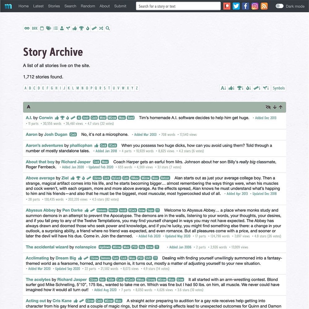
In March 2020 the site passed 1,500 stories. As of the end of 2020 there were over 1,700 stories on the site, from over 500 authors, with my own story count reaching 225 at the start of 2021.
2021: Weekly Updates and Various Tweaks
By 2020 the biweekly updates were getting large enough, with dozens of new chapters from contributors and three or four chapters from me, for me to seriously consider something I’d long wanted to try doing: going weekly. Starting at the end of December 2020, in celebration of exactly five years of regular biweekly updates, I went ahead and shifted to slightly smaller weekly updates. We’ll see how that goes.
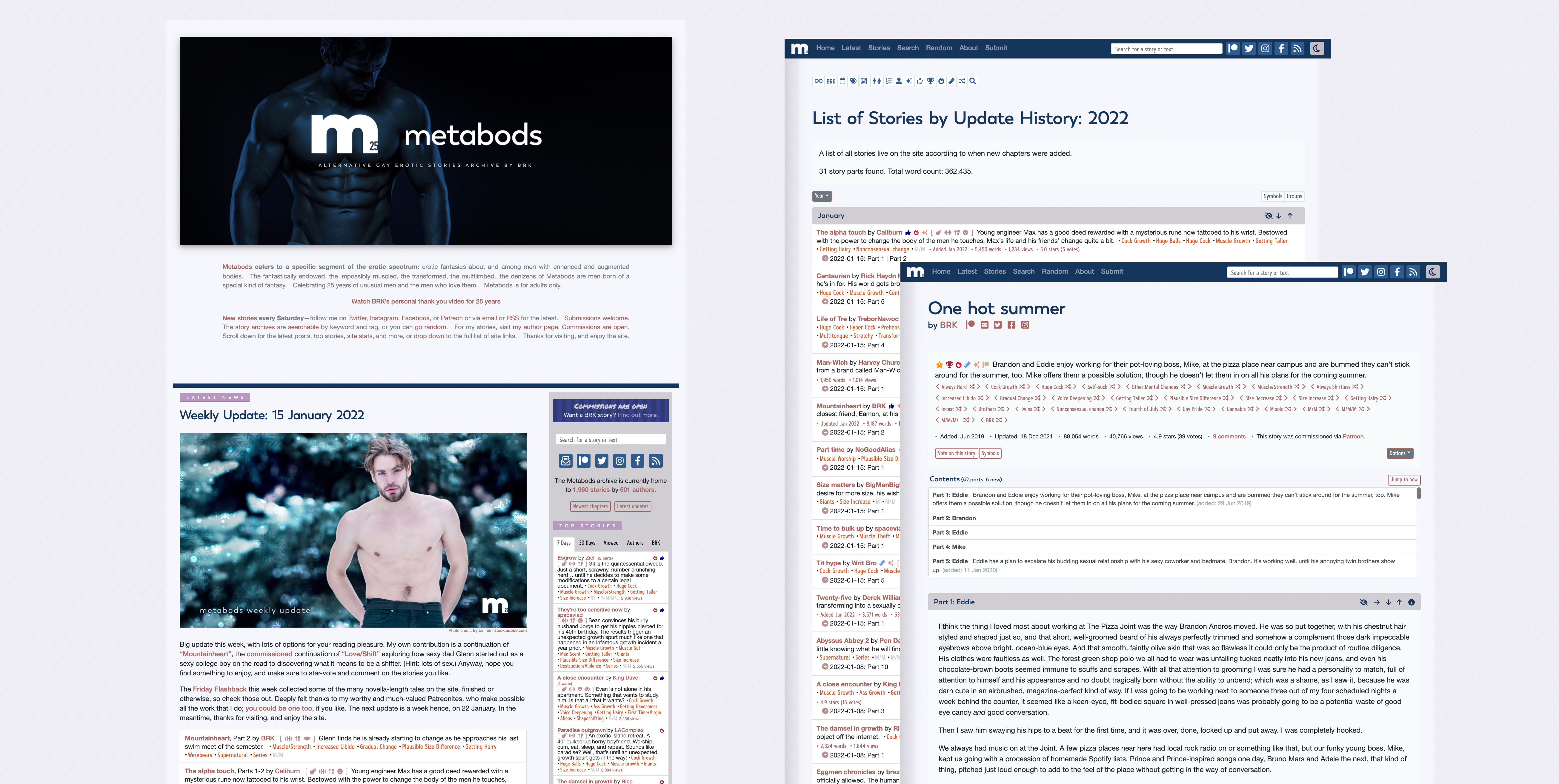
Since the site redesign in 2019 I’d been creating a cover pic for each Flashback and Update; these are used on the front page and news page and in my Twitter, Facebook, Patreon, and Instagram update posts. This chance to be visual is one of my favorite parts of the site update process, and in March 2021 I added a gallery page, updated automatically, to collect all of the cover pics for anyone who’s interested to enjoy. Around this time I also started including a credit line on the cover, news, and gallery pages to salute the original photographer of the stock image. (The stock photos are via Dreamstime and Adobe Stock.)
As I added to and diversified the list of available story tags, more and more stories were ending up with large piles of tag routers at the tops of their pages, all of them sort of blurring together. To visually associate related tags (muscles, extras, etc.), and to add some vibrancy to the story pages, in June 2021 I set up a scheme to group the tag routers by color. (This was abandoned not long after, as the variegated colors made some of the tags hard to read, but it was fun to create, at least. Later I got rid of the visual clutter of the tag routers by removing their button borders, since the previous/next chevrons—
In concert with this phase of hue-experimentation I also started coloring the badge icons that are placed before the story descriptions on the story and archive pages, and I added a new badge: in addition to the hollow thumbs-up (for 4+ stars and 5+ votes) and the solid thumbs-up (for 4.5+ stars and 5+ votes), there’s now a gold star with an exclamation point for stories with 4.5+ stars and 25+ votes, to recognize works with an extra-strong positive response from readers. (The icons I use on the site are via FontAwesome.)
It was at this time that a new and improved method of tag suggestion, which had been back-burnered during the 2019-2020 site revamp, was added back onto the site. Also in June 2021, a contents listing replaced the navigation buttons at the top of each story page with more than one chapter.
In August, I passed 2 million words as BRK.
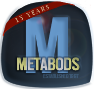
2022: Twenty-Fifth Anniversary
I decided early on in 2021 that the inauguration of my twenty-fifth year doing Metabods would involve three things. First, as with the 15th and 20th anniversary years, the Metabods logo would be modified to celebrate the new milestone, this time with a 25 incised into the “m” and a slightly different font for the wordmark.
![]()
This being me, a refreshed design scheme with a new color palette was obviously also required. The colors are night moon, deep blue, mandarin, lavender, and mauve.
The third thing was to create a thank you video to express my gratitude to all of the visitors, writers, and patrons that have been a part of Metabods, then and now.
But the main thing I wanted to do for the 25th anniversary was to keep going as I’ve been going, with weekly updates and new BRKness to make me and a few other folks out there happy.
There were other celebratory gestures, too. Several authors also graciously joined in a start-of-the-year gimmick involving stories in which the number 25 was somehow important. With all that was going on, January story page views passed 500,000 for the first time.
In March 2022, the Metabods archive passed 2,000 live stories. And in November, the word count of the stories on the side passed 20 million.
In November 2022 I quit Twitter after the actions of Elon Musk convinced me I did not want to be a part of his version of the social network platform.
2023- : Beyond 25
Toward the end of 2022 I asked my patrons if they wanted to see anything in particular as a special event to wind up the anniversary year, and the response that stuck with me was “just keep going.” Metabods simply being there has some meaning for a few people out in the world, but most of all for me, and it’s impossible for me to imagine writing for, maintaining, and improving the site not being a major part of my life.
In token of this, after the anniversary year I deliberately kept the same logo and design, the overall plan being to have fun doing what I’ve been doing and to continue making sure my writing, editing, and commissions are something that the readers and I can enjoy and rely on. Weekly updates, direct and Patreon story commissions, and bimonthly Patreon-prompted Vignette Parties continued as before.
Periodic tweaks were made to keep the site strong and fresh. The story page got a minor facelift in July 2023, mostly altering the design of the chapter titles to make them stand out better, clustering the chapter-head navigation buttons differently, changing the look of the section break markers within chapters, and tightening the tag pile at the top of the story and other header elements. A more major overhaul of the code behind the scenes took place at the same time, with the goal of streamlining database access and page loading. In July 2024 I added a visibility highlight to the tag router you reached a particular story from, to make it easier to continue browsing across a particular tag.
In April 2023 I did an interview with the website ThereSheGrows, a site dedicated to size-changing erotica. I talked about how my interests developed, how things have changed over the years, inspirations, and so on.
In September 2023 I joined BlueSky Social, a decentralized Twitter-alternative platform.
With weekly updates and regular commissions, my personal word count has mounted steadily. In March 2023, my word count as BRK passed 2.5 million, distributed across exactly 300 posted stories. I reached the 3 million mark in September 2024 and had some fun announcing it in that week’s cover image.

Another abundance-related landmark, this time for the whole site: in November 2024, the full story archive passed an amazing 25 million words across over 2,600 stories by 725 authors.
For the future, I intend to keep building Metabods, looking for ways to make sure it remains the best repository of enhanced and augmented gay male erotica I can make it, while still keeping it an amateur site in the original, Latin sense of the word, built and grown for the sheer fun of it.
For the most recent news, see the News page. To send me feedback on the site, go to the contact/submissions page. And thanks for stopping by.
For more on BRK commissions click here or go to commissions.metabods.com (Credit: Aaron Amat)
Share your upgraded-guy story at submit.metabods.com